Monday, October 18, 2010

A glimpse at information design


I came across a video clip of David McCandless, a journalist/information designer, who discussed information design and how important it is in society to be able to understand information. Check out the video clip on this website: http://www.designer-daily.com/the-beauty-of-data-visualization-by-dave-mccandless-9237

David McCandless provides examples of well-designed information designs, including graphs that show number of soldiers in countries, budget for armies in countries, times of year for break-ups from facebook updates, carbon dioxide emissions, and many more serious and humorous examples of information projected in clear visual displays. With information design, bland, complex information can, if designed well, be visually stimulating and easy to comprehend.
McCandless states “design is about solving problems and providing elegant solutions. And information design is about solving information problems.”
McCandless speaks of information and media overload. We have the internet, television, news articles, facts, figures—information of all kinds is all around us. We have become sensitive to sight, so visualizing information can clarify complex statistics and information.  Visual information helps us see patterns that matter. An interesting thing that information design can do is, as McCandless states, “even when the information is terrible, the visual can be quite beautiful” and “visualizing information can give us a very quick solution to [information problems].”

Comparison and contrast

Browsing through some of my photographs, I re-encountered a photo I took in the Louvre in Paris. I recall walking down an exhibit made for religious paintings, one after the other, it was the same theme of artwork in the entire expanse of the exhibit until I reached a large black, white, and grey abstract modern painting placed right between the rest of the religious paintings from hundreds of years ago. I laughed at how out of place the painting was. Perhaps the curators at the Louvre put it there by accident, I thought to myself.


Looking back on the photos I see the contrast between the two styles of art. I see how drastically art has evolved throughout time, yet the admiration for both styles of art remain of equal caliber. The older paintings demonstrate the era of detail and realism in painting, while the modern painting represents the more recent form of art as a less literal, more abstract idea. The modern painting contrasts greatly with the old religious paintings that surround it, yet both styles have similar roots: human creativity and expression.
I am still unsure as to the true reason for the placement of the modern painting amongst paintings of a completely different style and era, but I enjoyed the comparison and contrast of the painting. It gives a shocking juxtaposition in the exhibit, and makes one ponder on the evolution of not just painting styles, but also art and design.  

Design as conversation

Design is universal. It can speak to virtually any audience through signs, markings, icons, color, shapes…the list goes on and on. Design bridges the gap between the product, the creators, and the audience. Once the audience sees the design and the product, the conversation begins between designer and viewer or consumer. The only way for design to grow and evolve throughout time, for trends to form and die out, is for design to be exposed to the world. Once a design is out there, feedback can be exchanged, and design can change. Design is not just a process for designers. It is a process for everyone. Design needs to be tossed out there for people to see and react to, and that is how design can change and evolve over time, between the audience and the designer. Like a conversation, it is multidirectional and one feeds off the other. Design is a way people communicate ideas, like how talking between two people is a good way of communicating thoughts.

Lady Gaga and Yoko maintain an interesting conversation in their performance of Yoko Ono’s “The Sun is Down.” It represents the acceptance of one another’s influence in society despite the generational difference, and the conversation between past and present. Like Yoko Ono and Lady Gaga’s conversation, art and design speak to each other and influence the flow of what is to come in the future.

Recently, Gap redesigned its logo that has been around for more than twenty years into a more modern Helvetica sans-serif typeface. Instead of keeping their new design, they retracted it because of the sea of criticisms it received. Now, Gap is using a more interactive approach to finding the right design: a crowd-sourcing project. Gap wants to see “other ideas” from the public. On this website, http://www.idsgn.org/posts/gap-turns-to-crowdsourcing/, you can see a more in-depth article about Gap’s logo.

Gap’s “conversation” with the public demonstrates a process in design: communication of a logo to an audience, the audience’s response, and process of changing a logo to suite the desires of the audience.

Monday, October 11, 2010

Ephemeral Art


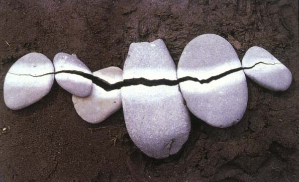
There is something inherently beautiful and mysterious about the ephemeral, the fleeting, the short-lived. Although it is sad to let wonderful things pass or leave without a trace, the idea that it existed once gives it even more beauty. The work of Andy Goldsworthy has always intrigued me since I learned about him in an art class several years ago, particularly his “Rain Shadow.”
Andy Goldsworthy works with nature and the environment to create ephemeral art within the environment. His medium of choice includes garlic leaves, sticks, snow, ice, twigs, sand, and other pieces of nature. Rather than painting leaves a certain color to match the palette he desires, he seeks out the leaves that are already naturally the colors that he wants, organizes them, and creates a piece of art.
Goldsworthy states, “I want to get under the surface. When I work with a leaf, rock, stick, it is not just that material in itself, it is an opening into the processes of life within and around it. When I leave it, these processes continue."
Goldsworthy teaches us that art can be even more meaningful when it is short-lived. Appreciation of its existence is the key to remembering the beauty that once was. 

Photo credits:
https://blogger.googleusercontent.com/img/b/R29vZ2xl/AVvXsEjcAT-QSItyALYg4Pqz5tajXgdmphK7iXbGJmm0jo6nbRIpInFXSUv4zTr8f4H6cjA4uzAJrmmafYUGYHI3cIQS8AqVjbHeBzbLVMWXFFCn6YdTxUPy-ffsytL1cFWMuKrWLqyJncW0_9E/s1600/RainShadow_1.jpg
http://www.writedesignonline.com/history-culture/AndyGoldsworthy/goldsworthy-pepples.jpg
http://img10.imageshack.us/f/art109.jpg/


Creativity from Without

Lisa Hoke creates rich, colorful artwork using media such as plastic and paper cups. She finds inspiration for creativity from such mundane objects, yet she uses the cups in a completely unique way to create beautiful pieces of art. Lisa Hoke fill entire walls with swirls of color. At first glance, I expected the artwork to be made of something else—something more “artistic” or “professional.” However, not all art must be made from paint on canvas, or pencil on paper. Artists and designers alike can find inspiration from without. Perhaps the shape and gleam of shimmer on the plastic cups inspired Lisa Hoke to use the cups to make a beautiful piece of artwork. Just as she finds inspiration from random objects, Jackson Pollock found creativity through paint, broken glass, sand, and other media with which he created his art. Pollock said “I feel nearer, more a part of the painting, since this way I can walk round it, work from the four sides and literally be in the painting. This is akin to the methods of the Indian sand painters of the West,” demonstrating his inspiration from a Native American art technique. In design, you should absorb the world around you and observe little details in order to find creativity from without. 


Photo credit: 
http://www.artinamericamagazine.com/files/2009/02/24/img-hoke_132030592636.jpg_standalone.jpg
http://www.lisahoke.com/images/homepage/35.jpg
http://www.artinthepicture.com/blog/wp-content/uploads/2007/08/action-painting.jpg


Stone Soup

The children’s folk story Stone Soup encourages one to contribute one’s materials to a group, share, and create something for everyone to be a part of and to enjoy. In last week’s Stone Soup activity, my group brought assorted materials including a cotton body suit, blue and green yarn, a Frisbee, construction paper, a board game, superman cape, pipe cleaners, tape, scissors, and a few other materials. With the mix of eclectic materials brought by each of the members of my group, we quickly thought of many ideas and began to construct our work of art together. Everyone had ideas to contribute and everyone had a task to work on. After only a few short minutes, our group whisked together a flying puppeteer with hair made of yarn and twigs connected to a puppet below on the ground.


Working on art when one is alone can be very fulfilling, but working on art together in a group of people can lead to great creations that can only be thought of with many people imputing ideas. Working together is a skill that is very useful in the professional world and necessary in design. In the creation of films, stone soup is the predominant mode of creation. Collaboration leads to the most creative results.

Part of our group's creation:
(Photo by Clarice Kwok)

Monday, October 4, 2010

First Impressions

The first three minutes of the film, Amélie provide the first impressions that set up expectations for the rest of the film. It involves random, quirky occurrences throughout the city of Paris, one of which is the moment at which Amelie is conceived. The conception and birth of Amelie demonstrate the lack of parental closeness or involvement in Amelie’s youth while growing up. As a child she resorts to solitary games, hinting at her future shyness resulting from solitude during her youth. The first three minutes set up the storyline and characteristics of Amelie in what is to come.

First impressions are important not only in relationships with other people, but also with subjects involved with design, like film, websites, and wayfinding signs. Signs that direct people to desired destinations must be designed in clear and concise ways in which the person can look at it and immediately know its meaning. Stop signs, street signs, exit signs, and maps are all designed in ways that leave good first impressions—impressions that help people find their way or understand rules. Additionally, first impressions are especially important in logo designs. Designers must be aware of designs that visually entice the customer just by looking at the logo of the product. If this logo is made well, the customer will be intrigued into purchasing the product. If the logo is not made well, the product will most likely fail. Thus, first impressions are important in all aspects of life, including design.

Is "design" a noun or a verb?


The word design is both a noun and a verb.
Design as a verb can be defined, in my own words, as an action involving planning and thinking of ideas, the act of creating something, and forming the structure of and object or something artistic. One can do the action of designing the layout of furniture in a room, the beginning of a film, a hairbrush, a jacket, or a drawing on a piece of paper. Design as a noun can be defined, in my own words, as the culmination of sketches, structures, and elements that make up an object or any kind of work of art. It is the final product. As a whole, design is a process and the result, or what comes out of, that process.

As I sit here in my dorm room looking at my bed with colorful designs covering it, the tapestry on my wall, the cereal box on my desk, the metallic smooth face of the microwave, I feel surrounded by the hard work of others. Sure, there are some things in my room that appear to be more artistic and designed purely for the eyes to enjoy and appreciate, but the tools and machines, lamps, logos and chairs in my room deserve more credit than they get. Designers had to use their creativity and resources to design the product and use their manual skills to actually create it. It is easy to ignore the logos on hand sanitizer bottles and tissue boxes. Many people do not see them as a piece of art like they might a painting or a drawing. However, those less obvious designed objects are still part of the design world, part of the process, and both nouns and verbs.


Photo credit: http://www.tate.org.uk/modern/exhibitions/cytwombly/images/img_autumn_lrg.jpg
http://thebeautybrains.com/wp-content/uploads/2007/01/013107hand-sanitizer.jpg

First Memories

As a child, I was given a hairbrush with a round, plastic back to which the bristles were attached. It was a travel hairbrush that folded in half and the bristles could be collapsed into the elastic plastic backing, turning the bulky brush into a compact piece of plastic. I recall the slightly addictive feel of pushing the bristles in and out of the brush, quickly, then more slowly, trying to figure out exactly how the bristles collapsed and flared out. I would try to take note of every movement, every angle of the bristles as they emerged from the depths of the soft, elastic plastic. I liked how I could store it easily and snap it open quickly to use to brush my hair with. The bristles were perfectly spaced, the perfect hardness to fulfill its purpose of untangling hair. The brush was smooth and slightly cool to the touch, smelled of plastic, and had a distinct snapping sound when opening it up. Back then, I was aware that its design worked well for my hair and for my entertainment during boredom. Now, I am aware of design in the simplest of objects. That hairbrush had to come from an idea, a plan, and had to be designed in a functional and aesthetically pleasing way.

Design is everywhere. Even in that little hairbrush. You can look anywhere in a room or on a street and find something that has been designed. In fact, most things you see are designed, except for nature. In Karl Blossfeldt’s Pumpkin Tendrils, Magnified 4x, we can see that the objects depicted, the pumpkin tendrils, are not designed, but the way they are depicted is.

Our world revolves around design, and even primitive humans had to design tools in order to survive. Design is in our past, present, and future. A hairbrush must have been invented and designed long ago, and the first brush must have looked much different than the one I used as a child. Design persists and evolves and will continue to expand in the future.


Photo credit: http://www.4cp.com.au/FoldingHairBrush.jpg