Monday, November 29, 2010

Design is Dangerous


The plastic water bottle is a dangerous design because of its simplicity, availability, functionality, and usefulness, creating a high demand for it, and finally causing pollution and waste on the planet. It is such a good design that it is available everywhere. It is so easy to find a place to purchase a plastic water bottle that people buy them with frequency. Since the bottles usually come in one standard size, often times the consumer does not drink the entire bottle of water, wasting the natural resource of water. Water bottles are so common that they end up everywhere --in the garbage cans, on the streets, and ideally in recycle bins, although most end up in landfills and in the ocean. The plastic water bottle was not designed to be dangerous. It was designed to provide the basic human resource of water to the people. However, it has become an important necessity for stores, grocery stores, and restaurants to have available for consumers. People unthinkingly buy plastic water bottles left and right, sometimes even daily. If plastic water bottles are to continue to be as popular as they are now, many changes in the industry and in society must be made. Recently, plastic bottle companies have begun to use thinner plastic to use fewer petroleum resources, which is a step in the right direction for society to have less waste and less consumption of resources. Additionally, more places on streets, stores, and homes should have recycle and compost bins. Too many plastic bottles end up in landfills when they can be recycled.
Plastic water bottles are also unhealthy to reuse several times because of a dangerous chemical called BPA that interferes with the body’s hormones. So even reusing a plastic bottle can be dangerous to one’s health.

Although it is a good design to store liquids, the plastic bottle is a hazard to the environment and to one’s health.


Utopian design in society: Earthships


Earthships are sustainable houses built of recycled materials and can be built in any climate in any part of the world. They heat and cool themselves naturally through passive solar heat and thermal dynamics from the ground, they collect their own power from the sun and wind, collect their own water from rainfall and snowmelt, treat their own sewage, produce a significant amount of food, and are constructed using natural and recycled materials such as tires, plastic bottles, glass bottles, aluminum cans, and mud. From a design standpoint, earthships succeed in one of the principles of design: functionality—it works, it serves its purpose of providing a sturdy, sustainable, permanent house for people. In this most basic principle, the earthships do not need to be aesthetically pleasing when its only purpose is to provide shelter for a family in need. For example, a small earthship was built in Haiti after the earthquake, housing a family in need of permanent shelter. Many Haitians were forced to reside in temporary makeshift tents, but when the earthship was built, they were left with the knowledge of how to build a permanent home in a quick and easy way. A group of Americans went to Haiti to teach the Haitians how to build a home using objects such as used tires, bottles, and cans, in addition to steel reinforcement in order to make it sturdy and safe during earthquakes. Bringing this knowledge to underdeveloped countries such as Haiti, along with many other throughout the world, will not only help the people of these countries create safe homes that do not need to be connected to the grid, but will also help reuse waste, causing a positive environmental impact by reducing pollution. Energy consumption in dealing with waste is high, so the more earthships, the fewer byproducts of civilized society that end up in landfills.


Another design principle is aesthetics. Earthships do not merely need to be built in simple ways—they can be designed beautifully as well. In many instances, glass bottles are used in mosaic patterns on the outer walls of the house, creating a beautiful feature on the exterior, or even interior, of the house. Many earthships contain indoor greenhouses in which the owner can grow plants and vegetables. This feature is important for the sustainable aspect of the house of producing food, but having plants in the house is an aesthetically pleasing feature as well.


Earthships are a positive influence in society because they provide easy sustainable shelter for the poor, along with beautifully designed houses for others. They are utopian because they help those in need in foreign countries and increase awareness of a need to lessen garbage and waste from products of civilized society. Earthships often have tours in which one can learn about the positive influence on society and on the environment these houses have.


Color transforms

Apple makes several different devices, including laptops, computers, music players, and cell phones. With the coming of the 1998 iMac, which came in several different colors, changed the idea of design for computers. Apple was the first company to branch out of the norm for computer design, which usually consisted of dull shades of black, white, off-white, or grey. The colors used with the original colorful iMacs were vibrant, attractive, fun, and evoked a sense of modernity because of the contrast between it and other dull-looking, boring computers. Now, Apple has designed attractive iPod Nanos and iPod Shuffles with vibrant and fun colors, adding an element of fun to the music devices.


Adding color to a design can be beneficial, as in the case with the iMacs and iPods.  However, adding the right colors in the right way is an important factor that determines whether or not the design will truly be aesthetically pleasing. When a color is placed next to another color, the color appears to change. In Albers’ Interaction of Color, he states “in order to use color effectively it is necessary to recognize that color deceives continually.” Colors should work harmoniously in a design—both colors benefitting one another, appearing in an aesthetically pleasing way.

The Apple products as individuals are attractive in their single color, and when placed next to one another, as in the photographs above, the colors work harmoniously as well. 


photo credit: https://blogger.googleusercontent.com/img/b/R29vZ2xl/AVvXsEg9koq344vYYBwIOrVF5jaCcCCnEtBHzI7EoQQ1puPTHKq8oHYf8GSy7_np4StoNePzijQ3OKnDPEm71siZ-2tqyyB_TLcWQD8pK-ptIY2NN-3H-4nr8SlbBpemfEa32ZPLRLNIaQ-3hi8/s1600/iMac_5up_flower.jpg
http://www.saudimac.com/wp-content/uploads/2008/09/ipod_nano_4g.jpg
http://www.sanctius.net/wp-content/uploads/2010/09/nouveau-ipod-nano-6g-2010-2011-9.png
http://apple.mmgn.com/Lib/Images/News/Normal/The-new-iPod-Shuffle-1050380.jpg

Monday, November 15, 2010

Klean Kanteen


The Klean Kanteen is the first BPA-free stainless steel reusable water bottle. BPA stands for Bisphenol A, a chemical compound commonly found in plastic water bottles. BPA may leech into the water, and it is unhealthy to digest, and may cause a variety of diseases and illnesses. The Klean Kanteen offers a safe and environmentally friendly alternative to plastic water bottles, all in an aesthetically pleasing design. The bottles come in a variety of colors and sizes, all made with a durable stainless steel. The bottle is curved instead of having hard corners and edges, not only making the bottle appear sleek, but also keeping health in mind—hard corners are easy places for bacteria and dirt to accumulate. The shape of the bottle makes holding the bottle easy, and the sport cap makes drinking from the bottle easy. The cap is designed in a way that allows you to drink from the bottle without squeezing the bottle like in plastic sports bottles. Water flows easily out of the cap, and the ring on the cap allows you to attach it to clips on backpacks, or even just holding it with one finger. The bottle comes in a variety of aesthetically pleasing colors, all painted with safe acrylic paint. The logo is simple and attractive, and the icon of the earth next to the word “klean” indicates the philosophy of the company of providing reusable bottles to eliminate waste and pollution to help the environment.   


photo credit: http://www.shopnaturally.com.au/images/klean-kanteen.jpg

Ergonomic design essay

Ergonomic design is related to Maslow’s hierarchy of needs—in Maslow’s pyramid, physiological needs are the most basic of human needs, and once these needs are satisfied, one can begin the process of self-actualization. However, in between these two extremes come the need of safety, love, and self-esteem. Like his psychological hierarchy of needs, there are also important areas of need in ergonomic design. First comes safety—an object cannot be successfully utilized if it is not safe. Then come the needs of comfort, ease of use, performance, and aesthetics. An object needs to comply with all five areas of need in order to be a great ergonomic design.
            Ergonomic design is task-appropriate and user-centered. I own a pair of “It’s Academic” scissors with a soft, yet firm rubber grip that allows comfort for the hand and easy mobility and functionality. There are two gaps of different sizes—one is smaller than the other, made for the thumb; and the other is larger, made big enough for the three furthermost fingers. Around the edge of the larger hole there is an indent for the index finger to grasp. The holes are rounded and elongated in shapes that fit with the shape of fingers. The size of the grip is proportionate the size and natural flow and shape of a hand. These factors contribute to the great comfort of the scissors.
There are two types of this brand of scissors—one is five inches long with a round tip, the other is seven inches long and has a pointed tip. The smaller with the round tip is especially safe for children to use. The stainless steel cutting blades are sharpened only on the inside edges where the cutting is occurring, not on the outer edges, preventing injuries from holding the blades when the scissors are closed.  Even when one pushes a finger against the sharpened edge of a blade, the skin does not get cut. The scissors are safe for both children and adults.
            The design of the grip for the scissors allows equal ease of use for both left and right-handedness. The simple up and down movement of the four fingers and the thumb in conjunction with the comfort of the grip and sharpness of the blades makes the scissors easy to use. The blades are placed right against each other in a way that allows the cutting motion of the blades to flow with just the right amount of friction to make the cutting process smooth, quick, and precise. The scissors work well with cutting paper, cardboard, and plastic, as long as the material is not too thick.
            These scissors are aesthetically pleasing with their dark blue rubber grip, and light grey portions of the grip. The shape is sleek and attractive, and the stainless steel cutting blades are placed at the center and emerge from the beautiful handle. The design is very simple, and simplicity in design is an important aspect in the aesthetics of a design. It is preferable to eliminate the extraneous, simplify the object until it makes one think, “of course it is designed that way, why would it be any other way?” The shape is simple, functional, and aesthetically attractive.
            The “It’s Academic” scissors fulfill the hierarchy of ergonomic design needs of safety, with its blunt outer edges and rounded tip; comfort, with its soft rubber grip and shape; ease of use, with only the need of simple hand gestures to make a cut; performance, with the precise ability to cut paper, cardboard, and thin plastic; and aesthetics, with its beautiful shape and color palette. 


Monday, November 8, 2010

Design thinking


Design thinking involves many steps that interact and intersect. Creativity is a big part of design thinking—you must be a sponge and absorb concepts, images, and ideas around you. Looking at your surroundings, reading books, and observing visual stimuli will help you attain ideas. However, there will be many things that a person will absorb that must be filtered out. A person should become aware of bad design and of what is aesthetically not pleasing to the eye. It is a selective process. Then, you should find your creative voice and discover what it is that you are all about. Finding one’s style and interests comes from personal experience, including some of the things one has absorbed.
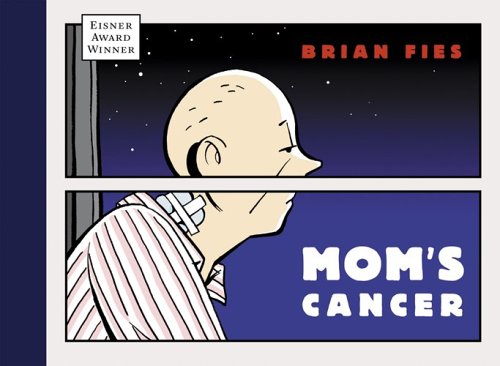
Brian Fies designs, writes, and draws his comics based off of his personal experience and what he has absorbed throughout his life. The content of the comics and graphic novels he creates is based off of his creative voice. He described his comics as summarizing everything about himself—he designed based off of his experiences and his personal ideas. Once he filtered out extraneous details and simplified his work, he finished his successful design of his comics. Design thinking is the most important aspect of all kinds of design.     
photo credit: http://sumthinblue.com/wp-content/uploads/2010/03/fies-moms-cancer.jpg


Book cover design -- word and image


The phrase “you can’t judge a book by it’s cover” can be correct to say when alluding to judging people by the way they appear on the outside, but I think that books can be judged by their covers. Designers can work with the words of the name of the book and the storyline of the book to design a cover that portrays the content of the book. Word and image can interact to reveal information about the book. The cover should be functional, convey information about the book, and should catch the attention of customers. Typography and imagery on the cover are important factors in conveying the tone of the book.

Chip Kidd is a famous book cover designer. He designed the book cover below, The Mind’s Eye by Oliver Sacks. The cover design plays with the idea of the eye and the mind, distorting and blurring parts of the letters. The book itself contains case studies of people whose ability to navigate throughout the world and communicate with others has become compromised because of issues with sight and vision. So, just by looking at the cover of the book, one can understand what issues the book explores.


photo credit: http://www.oliversacks.com/oliverpress/wp-content/uploads/2010/04/Sacks-Yellow-Red-2.jpg

Brian Fies-- word and image


Brian Fies is a comic book artist and graphic novelist, and some of his works include Mom’s Cancer and Whatever Happened to the World of Tomorrow? Comics are juxtaposed pictorial and other images in deliberate sequence, according to McCloud. In Brian Fies’ work, he uses clear, simple, and concise words in order to communicate the storyline in the best way possible in conjunction with the drawings and images he portrays. Like the clarity of the words, the drawings too are simple and clear. The best way to quickly communicate the story and symbolism of the story is to do so without any unnecessary details. Brian Fies orders the drawings and images in sequences that make the reader’s mind and eye translate them into meaning. There are sequences in the comics that have images and no words because the images can communicate the idea without the help of words. However, words are just as essential to the comic as are images. Brian Fies’ process for designing his comics is to create the script first, then look for opportunities where pictures and images can carry a load (as in, content and storyline). When he begins creating the comics, he writes the words first because it is most important for the order of the words to lead the eye through the page, and then he puts in the drawings. It is important to have an editing eye in order to eliminate the extraneous. It is all about simplification.
photo credit: http://markc1.typepad.com/photos/uncategorized/cancer_comic.jpg

Monday, November 1, 2010

Conceptual art

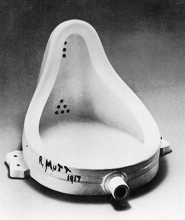
Marcel Duchamp is an artist who raised the question "what is art?" Duchamp's most well known piece is from 1917 named "Fountain," a manufactured urinal.


photo credit: http://www.beatmuseum.org/duchamp/images/fountain.jpg

In conceptual art, the idea is more important than the object. The idea is art. However, when Fountain was first put on display, there were mixed feelings about the piece. Some of the show organizers believed that Duchamp was equating modern art with a toilet fixture. Despite the criticisms, Fountain became the beginning of a new kind of art movement—conceptual art. Conceptual artists have emerged, like Yoko Ono, who not only create pieces of physical art, but also perform the art or have interactive art with the audience at an exhibition.
Art does not simply have to be paint on a canvas. The concepts and ideas that Yoko Ono wishes to express are evoked through the medium of performance and unconventional pieces. In Yoko Ono’s Cut Piece, the audience is invited to cut off pieces of Yoko Ono’s clothing. This piece is thought provoking and makes the audience experience oppression and gender roles in society. The performance is against racism and sexism.

photo credit: http://www.c4gallery.com/artist/database/janine-antoni/janine-antoni-loving-care-5-1993.jpg

Janine Antoni is a conceptual artist, and in her performance Loving Care, she uses hair dye to paint on the ground using her hair. This piece is about process. She uses her hair, moving her entire body across the floor, to create this piece.
Marcel Duchamp started the movement of conceptual art, beginning with Fountain, raising the question of “what is art?”


The MacBook Pro


The MacBook Pro is an example of the many Apple products that are designed as simply as possible. The laptop has a sleek aluminum shell without obtrusions or patterns. The only thing that is etched into the outside of the laptop is the Apple symbol, which in itself is a simplistic icon. When the laptop is opened, the black keyboard with the contrast of the white symbols and the backlighting is revealed. The speakers on either side of the keypad are slightly camouflaged with the aluminum, yet they make the keypad look framed in a simple and pleasant way. The screen is bright while the border of the screen is black and reflective, which makes the screen and what is being seen appear bright and attractive. The contrast of tone and color of the laptop makes it aesthetically pleasing to the eye. The MacBook Pro has a small light that indicates whether the laptop is on or off and a small power button. There are very few details when looking at the MacBook Pro, which is a good design technique. The best designs are simplistic and do not have anything that they do not need. The screen of the MacBook Pro shows the user beautiful and clear icons and user-friendly applications. Even the way one uses the laptop is simplistic and clear. The outward appearance of the laptop evokes the content of the product itself. On the outside, it is simple, attractive, and unobtrusive. The product itself is a user-friendly and simple to use machine that works beautifully and expands the realm of technology.

photo credit: http://www.komplettblog.ie/wp-content/uploads/macbook-pro11.jpg?w=300

Interaction of Form and Content in "Objectified"


Watching the film Objectified helped me understand some of the processes behind design. When we purchase an object, we rarely think of how the object came to be. The film increased my awareness of how ideas manifest into the form of objects. In the film, a design company creates a functional and ergonomic potato peeler after they heard of a woman with arthritis who could not use a certain type of potato peeler with an uncomfortable handgrip. The design group designed the peeler in a way that would minimize the physical discomfort of peeling potatoes in an attractive and functional way. The content, or the purpose of the object, dictates the form of the object in many cases. For example, a mug’s purpose of containing a warm beverage influences its form and design. It must have an appropriate shape to hold a liquid and a handle so as to minimize the possibility of burning a person’s skin. Good design has as little design as possible.  Design is the search for form. Designers must ask the question of what form an object should take based off of the content and purpose of the object. The best objects are the ones that feel undersigned and make people think “of course its that way, why would it be any other way?” 


photo credit: http://www.roullierwhite.com/ekmps/shops/roullierwhite/images/oxo-good-grips-swivel-potato-peeler-393-p.jpg

Monday, October 18, 2010

A glimpse at information design


I came across a video clip of David McCandless, a journalist/information designer, who discussed information design and how important it is in society to be able to understand information. Check out the video clip on this website: http://www.designer-daily.com/the-beauty-of-data-visualization-by-dave-mccandless-9237

David McCandless provides examples of well-designed information designs, including graphs that show number of soldiers in countries, budget for armies in countries, times of year for break-ups from facebook updates, carbon dioxide emissions, and many more serious and humorous examples of information projected in clear visual displays. With information design, bland, complex information can, if designed well, be visually stimulating and easy to comprehend.
McCandless states “design is about solving problems and providing elegant solutions. And information design is about solving information problems.”
McCandless speaks of information and media overload. We have the internet, television, news articles, facts, figures—information of all kinds is all around us. We have become sensitive to sight, so visualizing information can clarify complex statistics and information.  Visual information helps us see patterns that matter. An interesting thing that information design can do is, as McCandless states, “even when the information is terrible, the visual can be quite beautiful” and “visualizing information can give us a very quick solution to [information problems].”

Comparison and contrast

Browsing through some of my photographs, I re-encountered a photo I took in the Louvre in Paris. I recall walking down an exhibit made for religious paintings, one after the other, it was the same theme of artwork in the entire expanse of the exhibit until I reached a large black, white, and grey abstract modern painting placed right between the rest of the religious paintings from hundreds of years ago. I laughed at how out of place the painting was. Perhaps the curators at the Louvre put it there by accident, I thought to myself.


Looking back on the photos I see the contrast between the two styles of art. I see how drastically art has evolved throughout time, yet the admiration for both styles of art remain of equal caliber. The older paintings demonstrate the era of detail and realism in painting, while the modern painting represents the more recent form of art as a less literal, more abstract idea. The modern painting contrasts greatly with the old religious paintings that surround it, yet both styles have similar roots: human creativity and expression.
I am still unsure as to the true reason for the placement of the modern painting amongst paintings of a completely different style and era, but I enjoyed the comparison and contrast of the painting. It gives a shocking juxtaposition in the exhibit, and makes one ponder on the evolution of not just painting styles, but also art and design.  

Design as conversation

Design is universal. It can speak to virtually any audience through signs, markings, icons, color, shapes…the list goes on and on. Design bridges the gap between the product, the creators, and the audience. Once the audience sees the design and the product, the conversation begins between designer and viewer or consumer. The only way for design to grow and evolve throughout time, for trends to form and die out, is for design to be exposed to the world. Once a design is out there, feedback can be exchanged, and design can change. Design is not just a process for designers. It is a process for everyone. Design needs to be tossed out there for people to see and react to, and that is how design can change and evolve over time, between the audience and the designer. Like a conversation, it is multidirectional and one feeds off the other. Design is a way people communicate ideas, like how talking between two people is a good way of communicating thoughts.

Lady Gaga and Yoko maintain an interesting conversation in their performance of Yoko Ono’s “The Sun is Down.” It represents the acceptance of one another’s influence in society despite the generational difference, and the conversation between past and present. Like Yoko Ono and Lady Gaga’s conversation, art and design speak to each other and influence the flow of what is to come in the future.

Recently, Gap redesigned its logo that has been around for more than twenty years into a more modern Helvetica sans-serif typeface. Instead of keeping their new design, they retracted it because of the sea of criticisms it received. Now, Gap is using a more interactive approach to finding the right design: a crowd-sourcing project. Gap wants to see “other ideas” from the public. On this website, http://www.idsgn.org/posts/gap-turns-to-crowdsourcing/, you can see a more in-depth article about Gap’s logo.

Gap’s “conversation” with the public demonstrates a process in design: communication of a logo to an audience, the audience’s response, and process of changing a logo to suite the desires of the audience.

Monday, October 11, 2010

Ephemeral Art


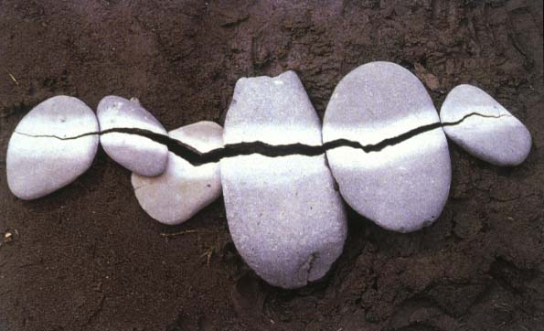
There is something inherently beautiful and mysterious about the ephemeral, the fleeting, the short-lived. Although it is sad to let wonderful things pass or leave without a trace, the idea that it existed once gives it even more beauty. The work of Andy Goldsworthy has always intrigued me since I learned about him in an art class several years ago, particularly his “Rain Shadow.”
Andy Goldsworthy works with nature and the environment to create ephemeral art within the environment. His medium of choice includes garlic leaves, sticks, snow, ice, twigs, sand, and other pieces of nature. Rather than painting leaves a certain color to match the palette he desires, he seeks out the leaves that are already naturally the colors that he wants, organizes them, and creates a piece of art.
Goldsworthy states, “I want to get under the surface. When I work with a leaf, rock, stick, it is not just that material in itself, it is an opening into the processes of life within and around it. When I leave it, these processes continue."
Goldsworthy teaches us that art can be even more meaningful when it is short-lived. Appreciation of its existence is the key to remembering the beauty that once was. 

Photo credits:
https://blogger.googleusercontent.com/img/b/R29vZ2xl/AVvXsEjcAT-QSItyALYg4Pqz5tajXgdmphK7iXbGJmm0jo6nbRIpInFXSUv4zTr8f4H6cjA4uzAJrmmafYUGYHI3cIQS8AqVjbHeBzbLVMWXFFCn6YdTxUPy-ffsytL1cFWMuKrWLqyJncW0_9E/s1600/RainShadow_1.jpg
http://www.writedesignonline.com/history-culture/AndyGoldsworthy/goldsworthy-pepples.jpg
http://img10.imageshack.us/f/art109.jpg/


Creativity from Without

Lisa Hoke creates rich, colorful artwork using media such as plastic and paper cups. She finds inspiration for creativity from such mundane objects, yet she uses the cups in a completely unique way to create beautiful pieces of art. Lisa Hoke fill entire walls with swirls of color. At first glance, I expected the artwork to be made of something else—something more “artistic” or “professional.” However, not all art must be made from paint on canvas, or pencil on paper. Artists and designers alike can find inspiration from without. Perhaps the shape and gleam of shimmer on the plastic cups inspired Lisa Hoke to use the cups to make a beautiful piece of artwork. Just as she finds inspiration from random objects, Jackson Pollock found creativity through paint, broken glass, sand, and other media with which he created his art. Pollock said “I feel nearer, more a part of the painting, since this way I can walk round it, work from the four sides and literally be in the painting. This is akin to the methods of the Indian sand painters of the West,” demonstrating his inspiration from a Native American art technique. In design, you should absorb the world around you and observe little details in order to find creativity from without. 


Photo credit: 
http://www.artinamericamagazine.com/files/2009/02/24/img-hoke_132030592636.jpg_standalone.jpg
http://www.lisahoke.com/images/homepage/35.jpg
http://www.artinthepicture.com/blog/wp-content/uploads/2007/08/action-painting.jpg


Stone Soup

The children’s folk story Stone Soup encourages one to contribute one’s materials to a group, share, and create something for everyone to be a part of and to enjoy. In last week’s Stone Soup activity, my group brought assorted materials including a cotton body suit, blue and green yarn, a Frisbee, construction paper, a board game, superman cape, pipe cleaners, tape, scissors, and a few other materials. With the mix of eclectic materials brought by each of the members of my group, we quickly thought of many ideas and began to construct our work of art together. Everyone had ideas to contribute and everyone had a task to work on. After only a few short minutes, our group whisked together a flying puppeteer with hair made of yarn and twigs connected to a puppet below on the ground.


Working on art when one is alone can be very fulfilling, but working on art together in a group of people can lead to great creations that can only be thought of with many people imputing ideas. Working together is a skill that is very useful in the professional world and necessary in design. In the creation of films, stone soup is the predominant mode of creation. Collaboration leads to the most creative results.

Part of our group's creation:
(Photo by Clarice Kwok)

Monday, October 4, 2010

First Impressions

The first three minutes of the film, Amélie provide the first impressions that set up expectations for the rest of the film. It involves random, quirky occurrences throughout the city of Paris, one of which is the moment at which Amelie is conceived. The conception and birth of Amelie demonstrate the lack of parental closeness or involvement in Amelie’s youth while growing up. As a child she resorts to solitary games, hinting at her future shyness resulting from solitude during her youth. The first three minutes set up the storyline and characteristics of Amelie in what is to come.

First impressions are important not only in relationships with other people, but also with subjects involved with design, like film, websites, and wayfinding signs. Signs that direct people to desired destinations must be designed in clear and concise ways in which the person can look at it and immediately know its meaning. Stop signs, street signs, exit signs, and maps are all designed in ways that leave good first impressions—impressions that help people find their way or understand rules. Additionally, first impressions are especially important in logo designs. Designers must be aware of designs that visually entice the customer just by looking at the logo of the product. If this logo is made well, the customer will be intrigued into purchasing the product. If the logo is not made well, the product will most likely fail. Thus, first impressions are important in all aspects of life, including design.

Is "design" a noun or a verb?


The word design is both a noun and a verb.
Design as a verb can be defined, in my own words, as an action involving planning and thinking of ideas, the act of creating something, and forming the structure of and object or something artistic. One can do the action of designing the layout of furniture in a room, the beginning of a film, a hairbrush, a jacket, or a drawing on a piece of paper. Design as a noun can be defined, in my own words, as the culmination of sketches, structures, and elements that make up an object or any kind of work of art. It is the final product. As a whole, design is a process and the result, or what comes out of, that process.

As I sit here in my dorm room looking at my bed with colorful designs covering it, the tapestry on my wall, the cereal box on my desk, the metallic smooth face of the microwave, I feel surrounded by the hard work of others. Sure, there are some things in my room that appear to be more artistic and designed purely for the eyes to enjoy and appreciate, but the tools and machines, lamps, logos and chairs in my room deserve more credit than they get. Designers had to use their creativity and resources to design the product and use their manual skills to actually create it. It is easy to ignore the logos on hand sanitizer bottles and tissue boxes. Many people do not see them as a piece of art like they might a painting or a drawing. However, those less obvious designed objects are still part of the design world, part of the process, and both nouns and verbs.


Photo credit: http://www.tate.org.uk/modern/exhibitions/cytwombly/images/img_autumn_lrg.jpg
http://thebeautybrains.com/wp-content/uploads/2007/01/013107hand-sanitizer.jpg

First Memories

As a child, I was given a hairbrush with a round, plastic back to which the bristles were attached. It was a travel hairbrush that folded in half and the bristles could be collapsed into the elastic plastic backing, turning the bulky brush into a compact piece of plastic. I recall the slightly addictive feel of pushing the bristles in and out of the brush, quickly, then more slowly, trying to figure out exactly how the bristles collapsed and flared out. I would try to take note of every movement, every angle of the bristles as they emerged from the depths of the soft, elastic plastic. I liked how I could store it easily and snap it open quickly to use to brush my hair with. The bristles were perfectly spaced, the perfect hardness to fulfill its purpose of untangling hair. The brush was smooth and slightly cool to the touch, smelled of plastic, and had a distinct snapping sound when opening it up. Back then, I was aware that its design worked well for my hair and for my entertainment during boredom. Now, I am aware of design in the simplest of objects. That hairbrush had to come from an idea, a plan, and had to be designed in a functional and aesthetically pleasing way.
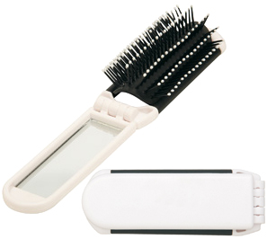
Design is everywhere. Even in that little hairbrush. You can look anywhere in a room or on a street and find something that has been designed. In fact, most things you see are designed, except for nature. In Karl Blossfeldt’s Pumpkin Tendrils, Magnified 4x, we can see that the objects depicted, the pumpkin tendrils, are not designed, but the way they are depicted is.

Our world revolves around design, and even primitive humans had to design tools in order to survive. Design is in our past, present, and future. A hairbrush must have been invented and designed long ago, and the first brush must have looked much different than the one I used as a child. Design persists and evolves and will continue to expand in the future.


Photo credit: http://www.4cp.com.au/FoldingHairBrush.jpg